
A data-rich Chicago Bulls infographic that transforms statistics and narrative into a visually compelling, shareable story. Every design decision, from icon choice to color hierarchy, serves clarity and engagement.
How We Made It Happen
Data Research & Structure
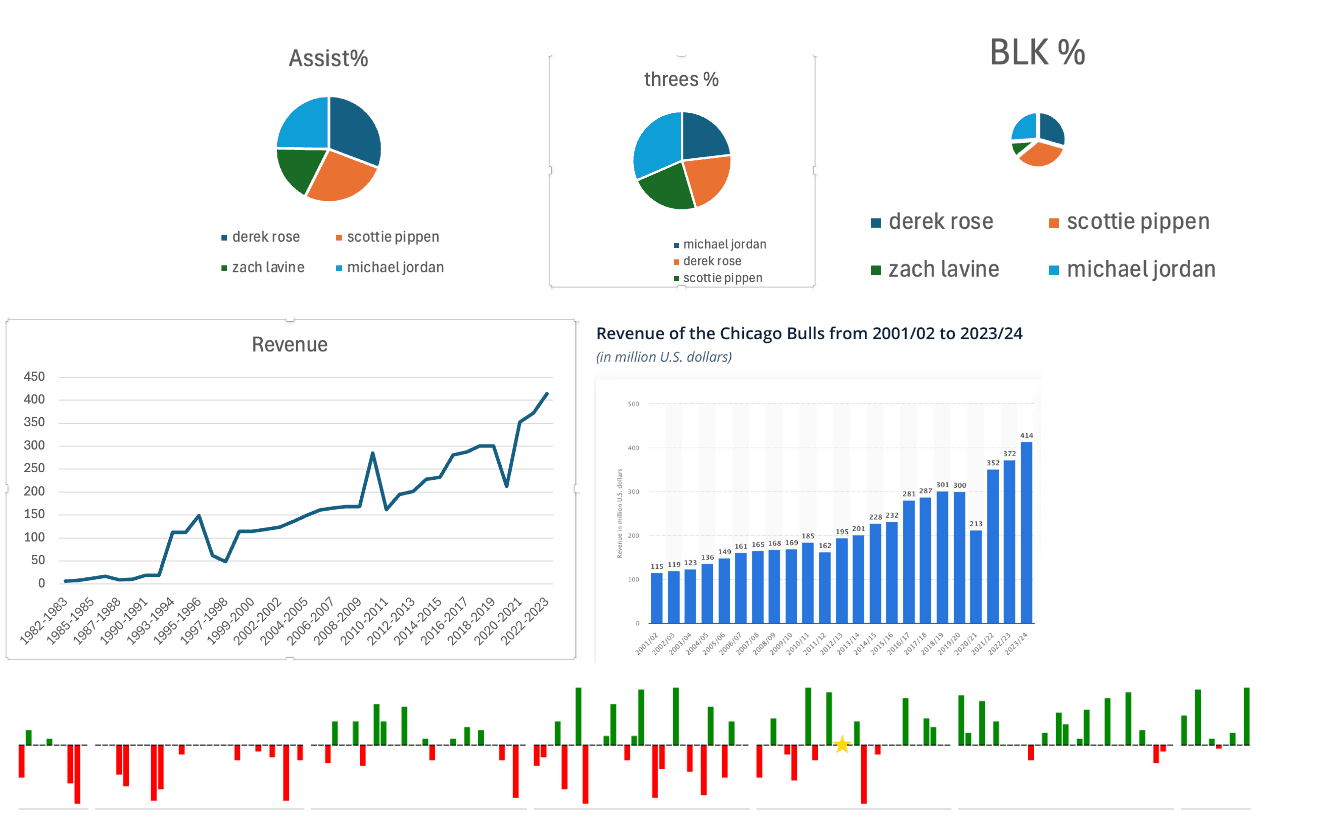
We researched and curated the key statistics and narrative points, then organized them into a logical hierarchy, determining what leads the eye, what supports the story, and what can be cut.
Visual Hierarchy Draft
Rough wireframes mapped out the infographic's reading flow, grouping related data points and balancing text density with breathing room to keep the eye moving without losing the reader.
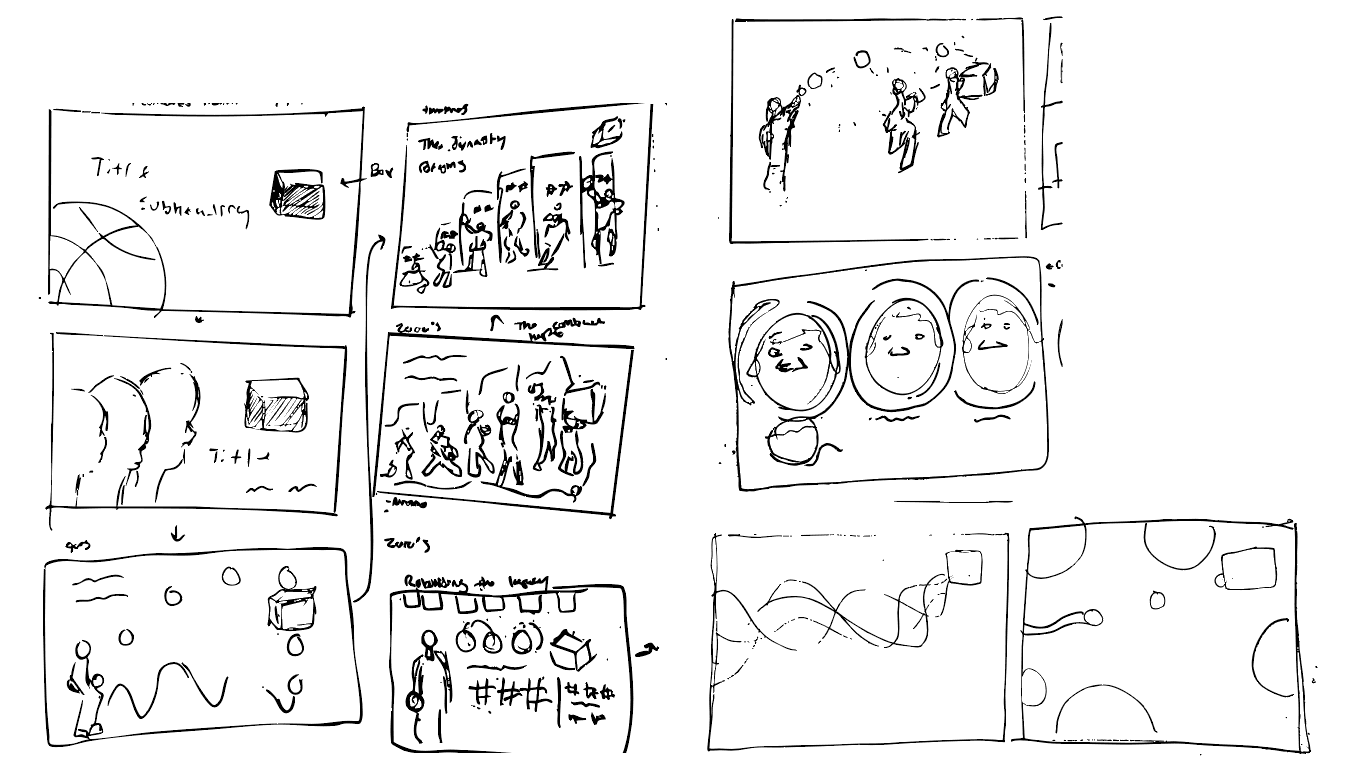
Illustration & Icons
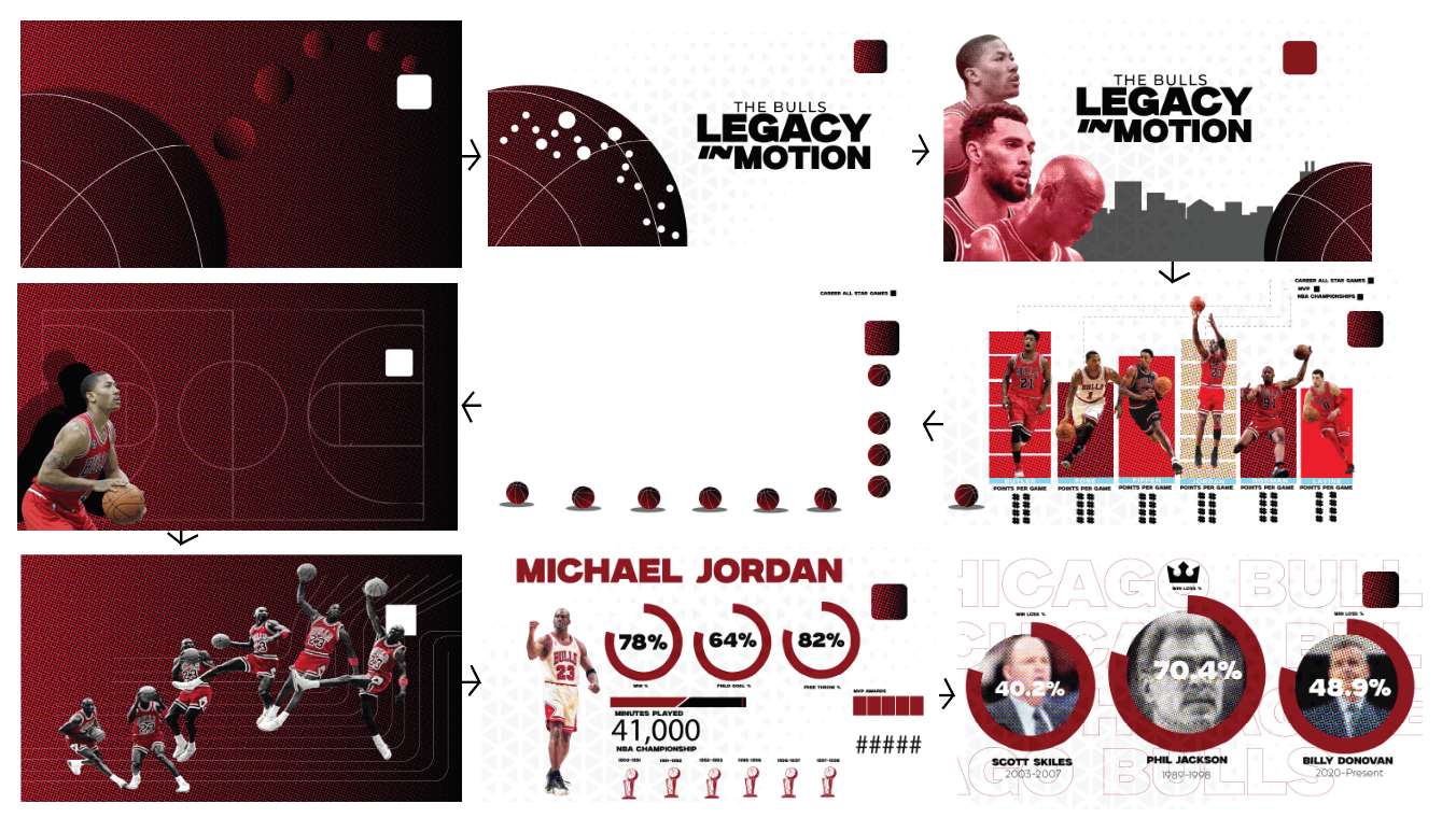
Custom icons and illustrations were developed to visualize each data category, reinforcing the Bulls brand language while keeping every element recognizable and on-theme.
Final Infographic
The complete infographic, polished typography, consistent color application, and verified data, delivered ready for print, social media, and digital distribution.
Want Something Like This?
Tell us about your project and we'll outline scope, timeline, and next steps.