
Brand identity design for COREC, from logo exploration through a full brand system covering print, digital, and signage.
How We Made It Happen
Discovery & Research
We began with stakeholder interviews and competitive landscape analysis, establishing the brand's core values, target audience, and strategic positioning before any visual work began.

Logo Concepts
Multiple logo directions were explored, each reflecting a different dimension of the brand. Sketches ranged from abstract marks to wordmarks to combination logos, giving the client real choices.
Typography System
A type system was selected to complement the approved logo direction, pairing a strong display face with a highly legible body font for seamless application across print and digital.
Color Palette
The brand color palette was developed to feel energetic yet professional, with primary and secondary colors specified for both digital (RGB/HEX) and print (CMYK/Pantone) use.

Brand Applications
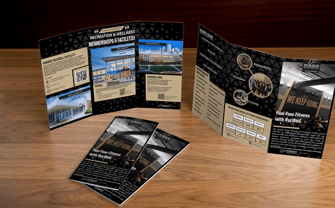
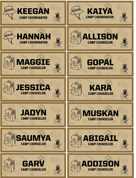
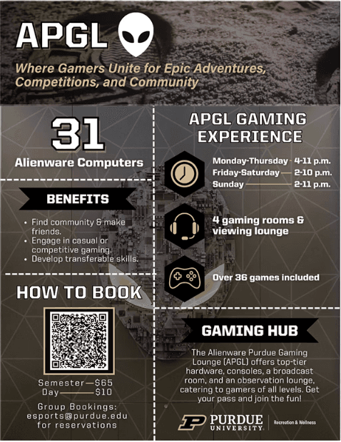
The identity was applied across key brand touchpoints, uniforms, signage, digital graphics, and printed collateral, to test cohesion and consistency across real-world contexts.
Mockup Presentation
Photorealistic mockups demonstrated how the brand identity performs in real-world applications, enabling confident client sign-off before final production and deployment.

Final Brand Identity
The complete brand system delivered, logo files in all formats, a comprehensive brand style guide, and a full asset library ready for deployment across every channel and medium.
Want Something Like This?
Tell us about your project and we'll outline scope, timeline, and next steps.