
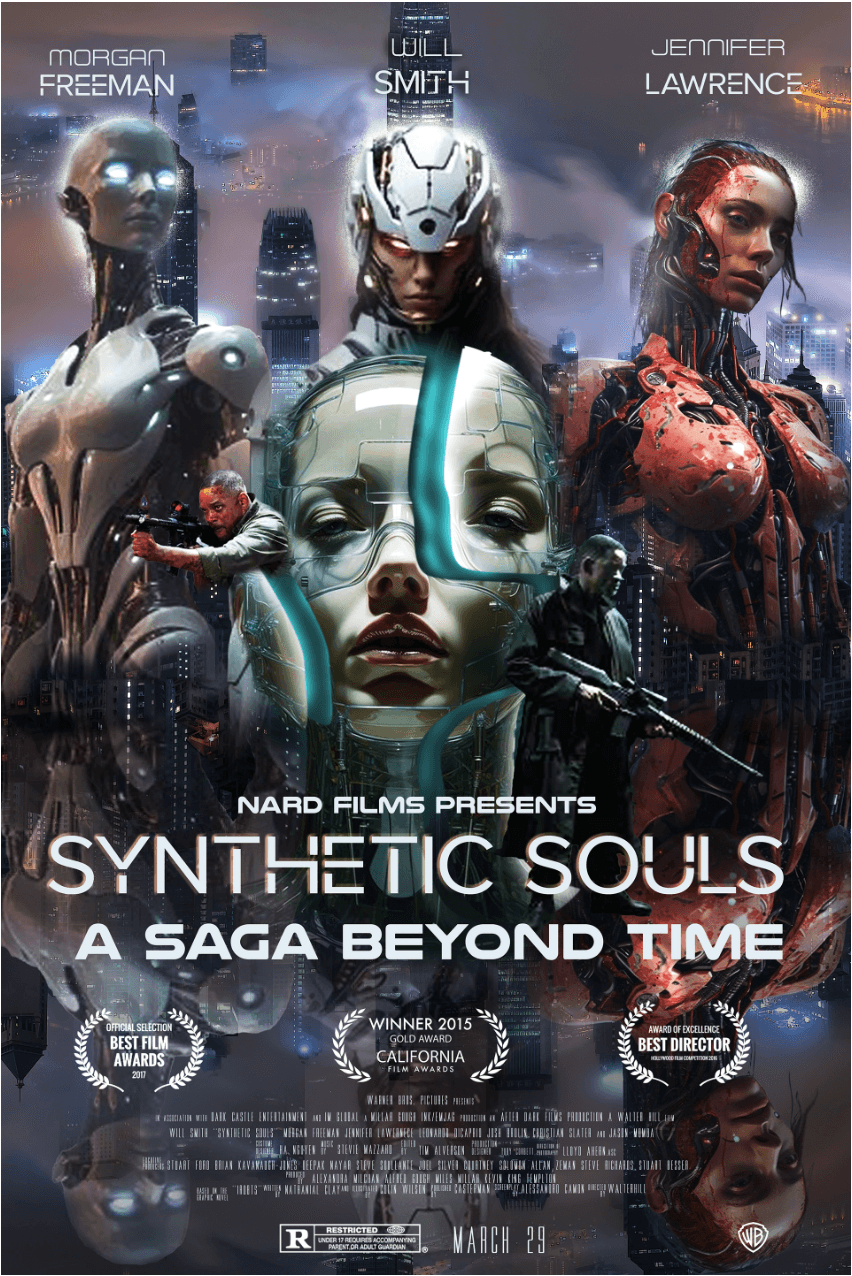
A full cinematic poster designed from the ground up, concept to print-ready file. Every element, from typography to photo composition, was crafted to capture the mood and narrative of the film.
How We Made It Happen
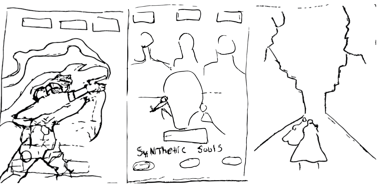
Initial Concept
We started with a deep-dive into the film's tone, genre, and target audience. Mood boards were assembled and rough compositional sketches explored different visual approaches before any pixel was placed.
Typography Treatment
Title typography is the anchor of any movie poster. We tested multiple typefaces and weights, balancing cinematic impact with legibility across all print sizes, from theater standee to digital thumbnail.
Color Palette Development
Color sets the emotional tone before the viewer reads a single word. We developed a palette that communicates genre and mood at a glance, tested against both light and dark backgrounds.
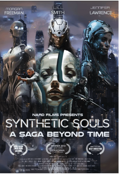
Composition Draft
With palette and type locked in, we assembled the first full composition, balancing foreground elements, visual hierarchy, and negative space to guide the eye naturally through the poster.
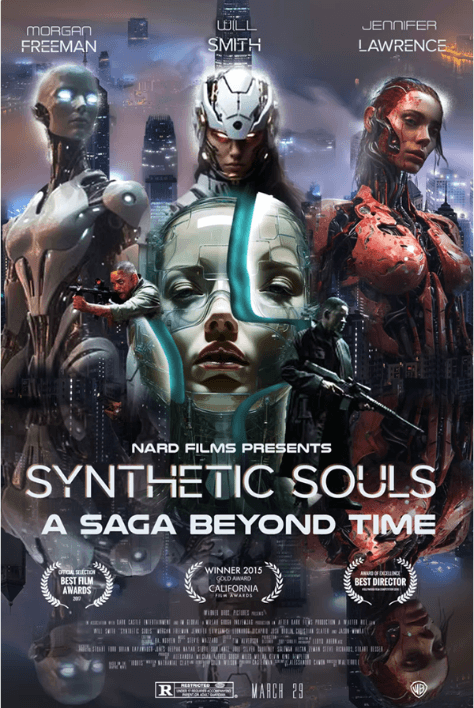
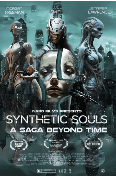
Photo Integration
Source photography was color-graded, masked, and composited into the layout, ensuring seamless integration with illustrated and typographic elements across every layer.
Final Refinements
Client feedback was incorporated in a focused revision round, fine-tuning contrast, crop, billing block details, and tagline placement for full theatrical compliance.
Finished Poster
The final print-ready poster, delivered in high-resolution press format with bleed and crop marks, ready for both theatrical display and digital release across all platforms.
Want Something Like This?
Tell us about your project and we'll outline scope, timeline, and next steps.