
A responsive website built with a mobile-first approach — adapting fluidly across phone, tablet, and desktop breakpoints while maintaining visual consistency and user clarity at every size.
The Process
How We Made It Happen
01/02
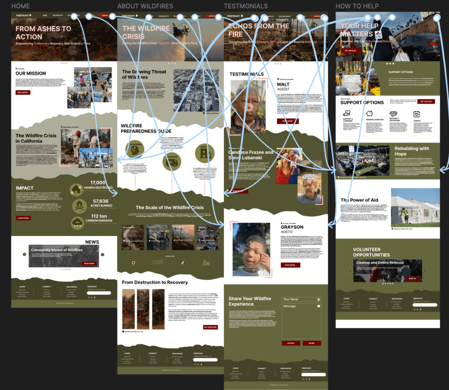
Desktop Layout
The full-width desktop layout was designed first, establishing the content hierarchy, navigation structure, grid system, and primary visual language that would scale down to all breakpoints.
02/02
Mobile Breakpoint
The layout was adapted for small screens — reordering content blocks, adjusting typography scales, collapsing navigation patterns, and optimizing touch targets for a seamless mobile experience.
Want Something Like This?
Tell us about your project and we'll put together a plan built around your vision.